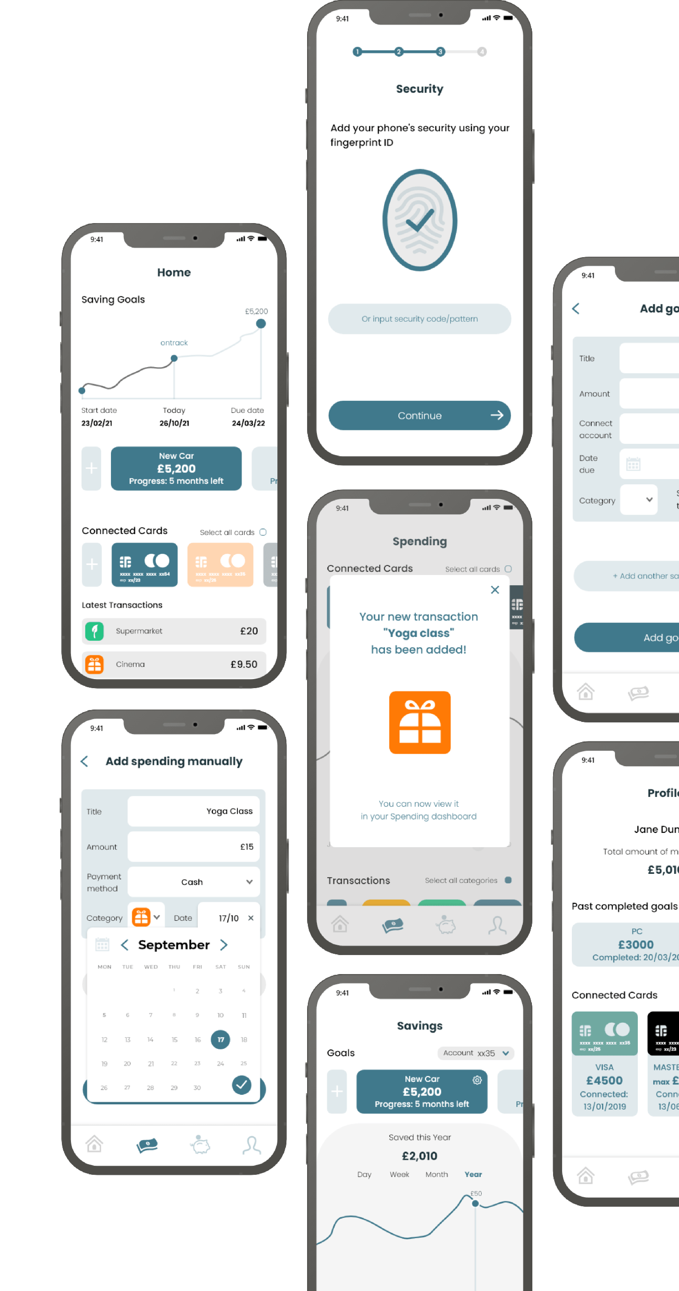
Saving made easy, without the stress
Overview
Role
UI Design
UX Research
Tools
Adobe XD
Timeline
Oct - Nov '21
Challenge
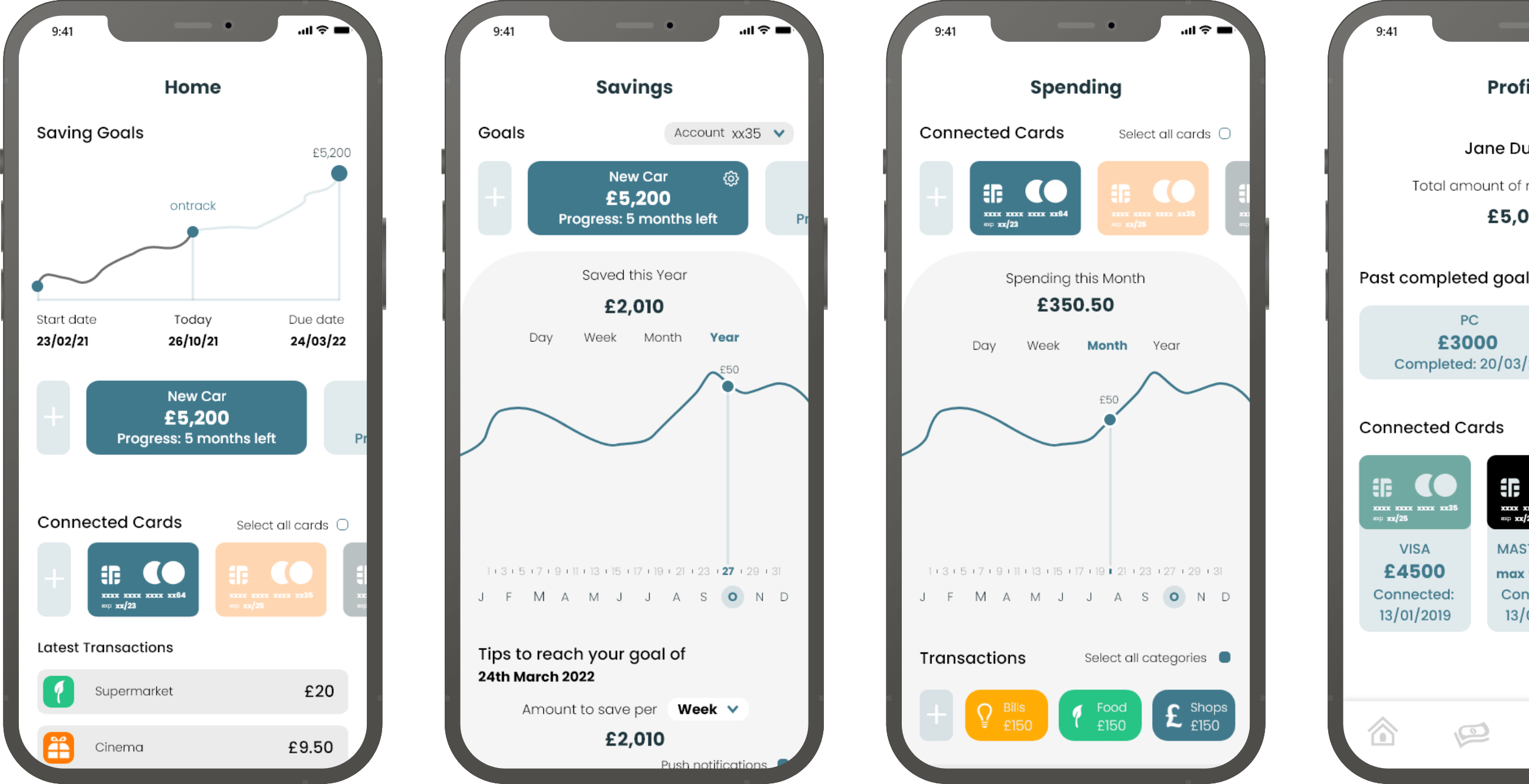
To design an app as a personal project which helps users to save money by keeping track of their spending from cards & cash to aid them to complete their saving goals.
The app was designed with a brand design guideline to stay true to the message of the app, this was a big consideration in the steps of designing this app.
5w's
Through questioning who the user will be and the reasons why they should use this app aided the process of creating user stories and focusing on the most important aspects Crunch should have.
Who
For people who are looking for assistance to save up money for multiples things.
Where
Used from any device which are linked keeping track through account.
What
Responsive web app and mobile app allowing users to easily record their spending and saving goals.
When
Users will utilize the tool in a time when they are saving up for an expense/or multiple.
Why
Offering users personalised saving tips and fit to their amount/time scale.
User Stories
1
As a money-saver, I need to be able to input information on the money I am receiving and spending(and on what), so that I can see an overview of my finances.
2
As a user, I want to see a dashboard of my finances clearly and visually,so that I can see how much I am spending on what at a glance.
3
As a user, I need to be able to tell the tool what my savings goal is and how long I have to reach it, so that I can save accordingly.
User Flows
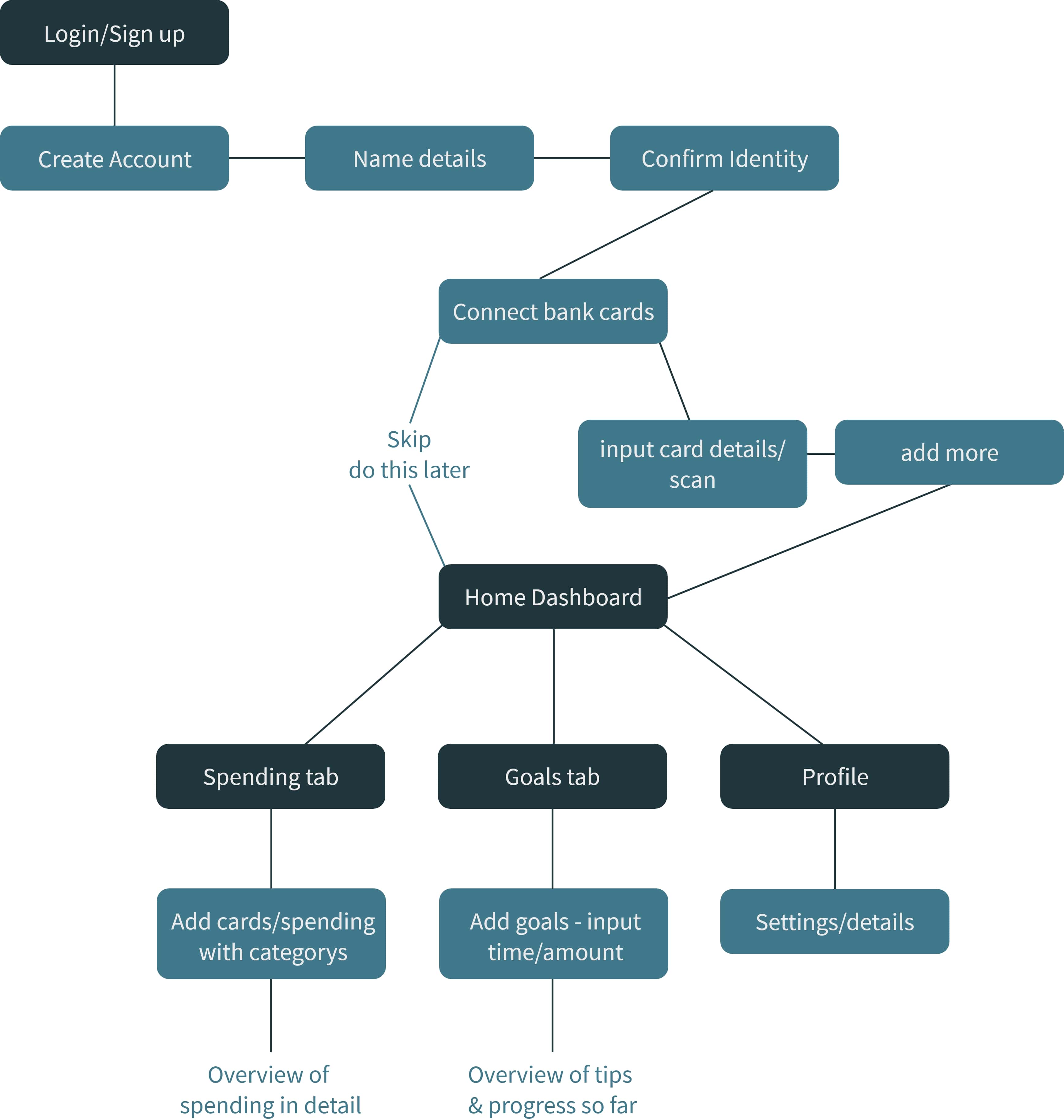
By taking the main user stories I have chosen to include in my screen I then translated these stories into one flow planning the screens.
Choosing the most important screens and defining them here helped the process all the way to my final screens.
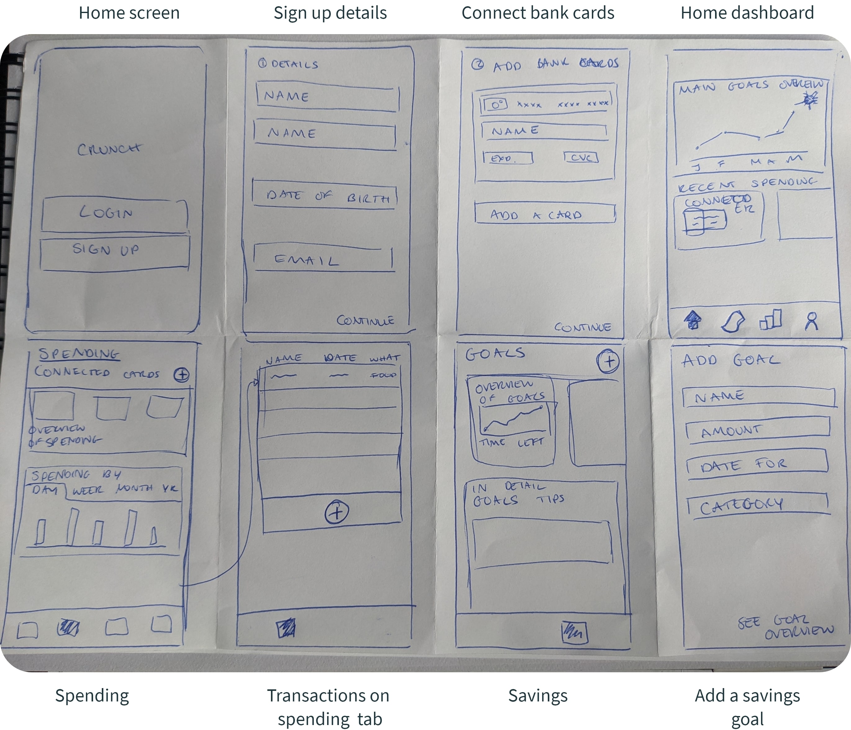
Low Fidelity Sketches
Taking the user flow I then quickly sketched basic layout ideas and processes of the most important screens. I decided to try and keep the amount of screens simple and for every decision made to have a purpose.
With these initial low fidelity sketches I then moved straight to digital to keep momentum and get onto testing designs.
Mid Fidelity Usability Testing
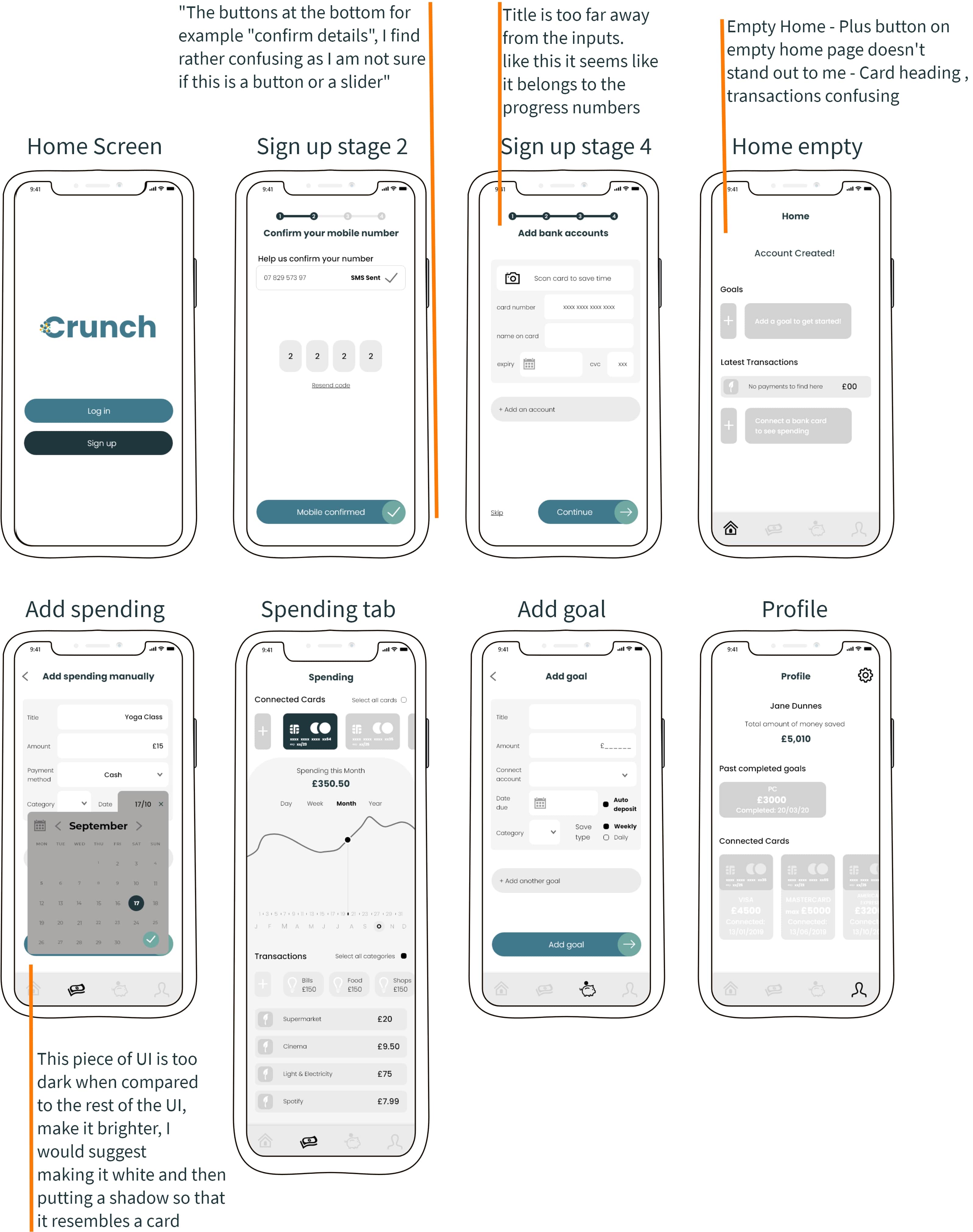
I had 4 participants test my prototype of mid fidelity screens. The comments were the main pain points they highlighted that I took forward and applied these changes to the screens.
Scenario:
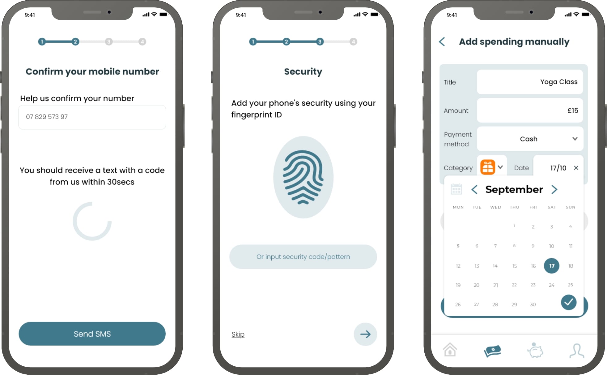
New user looking to sign up to Crunch adding their bank accounts, viewing the dashboard showing an overview of their spending and savings.
Furthermore being able to view specific insights for their savings and expenditures alongside being able to add manual spending and saving goals.
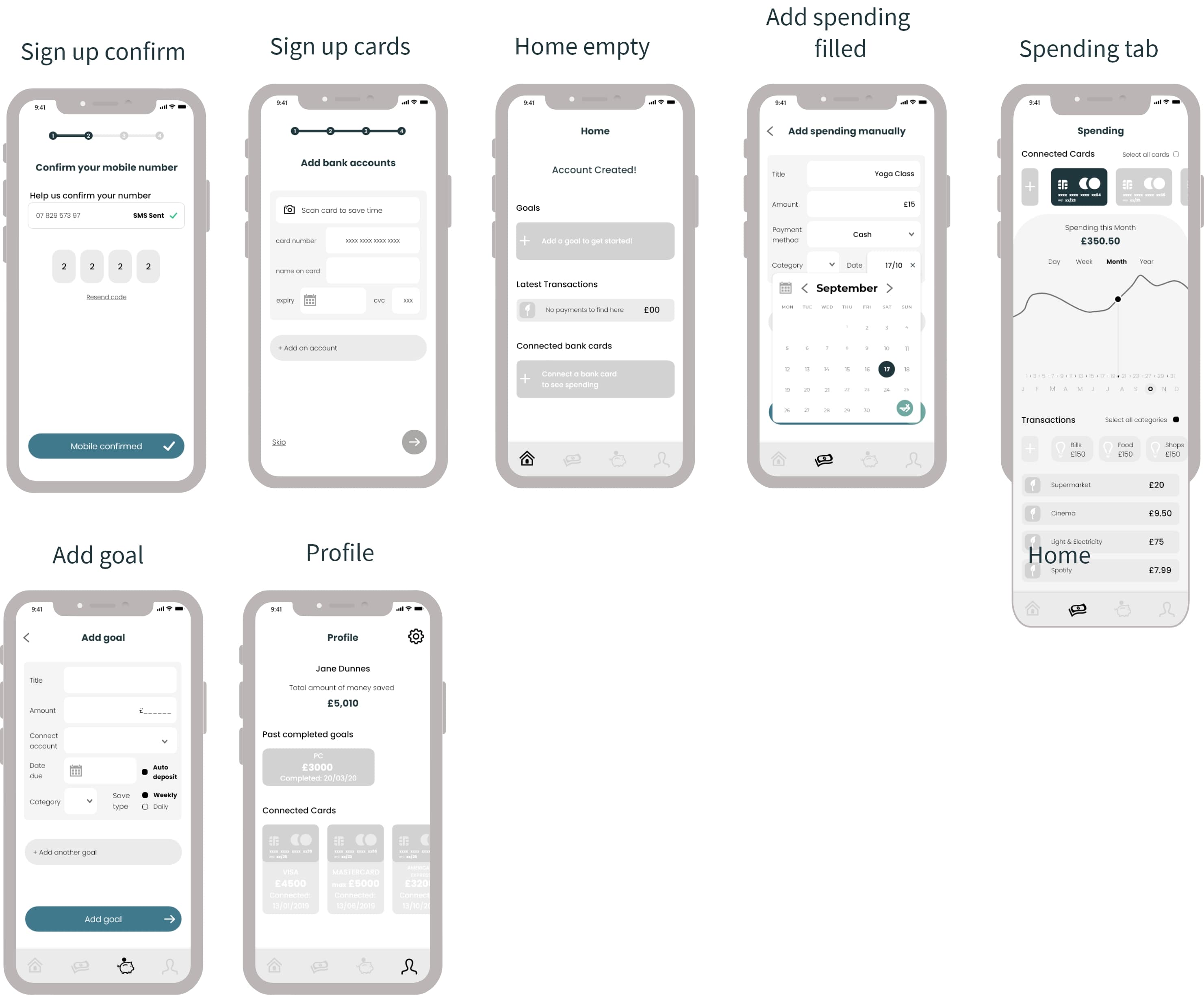
Greyscale High Fidelity Post Feedback
Testing early on before the application of any brand design guidelines aided the processto make sure the user journey was the best it could be. The majority of changes from the issues found by users involved aspects which were not clear enough.
I would definitely take this forward to other projects in the future and applying a fresh mind to avoid confusing designs.
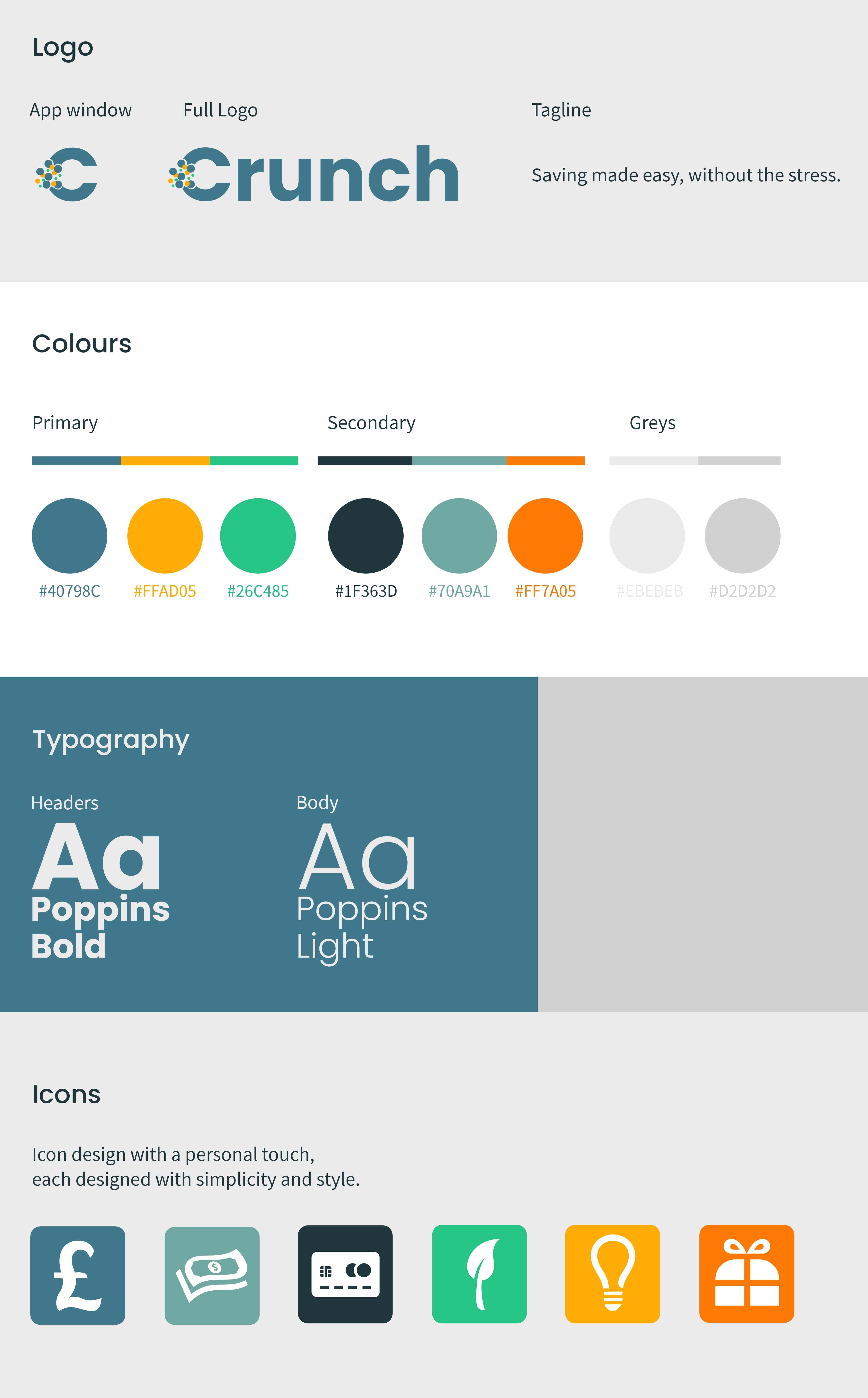
Creating a brand guideline
For this money saving app, I thought of crunch as in money crunch for the name and so tried to express this in the "C" design with coins coming out of it giving it some sense of light and fun
I want the app to feel sophisticated since it is dealing with big amounts of money for users and at the same time for users to be relaxed while using the app which is the reasoning for the colours I picked. I chose a toned down blue as my primary colour alongside some complimentary to try make the user feel at ease and that they are using a trustworthy app.
Web Design
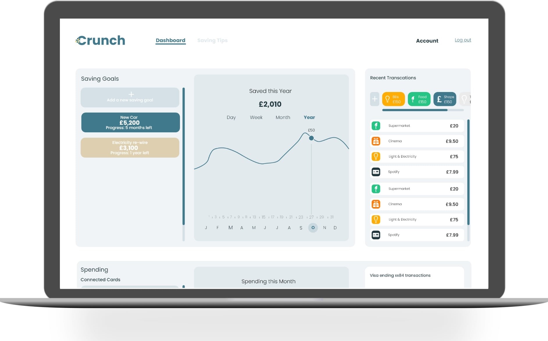
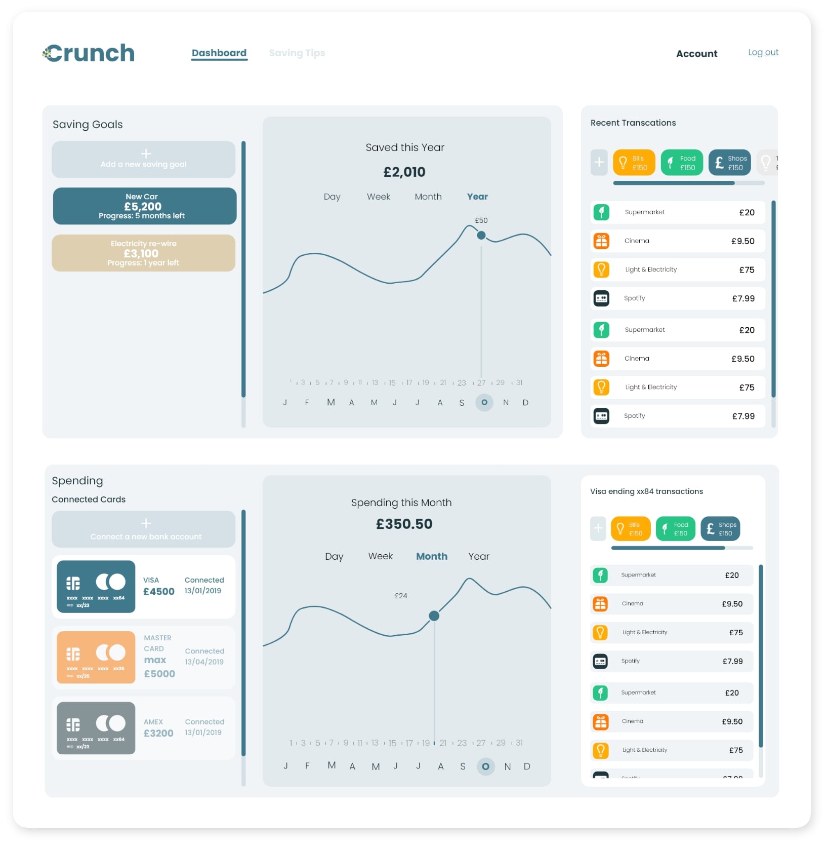
It was important for the app's users to be able to access their spending and saving goals through other devices, which is the reason I have included a design of the home screen dashboard.
Keeping the dashboard on the website design as simple as possible to mirror the concept of the app was important.
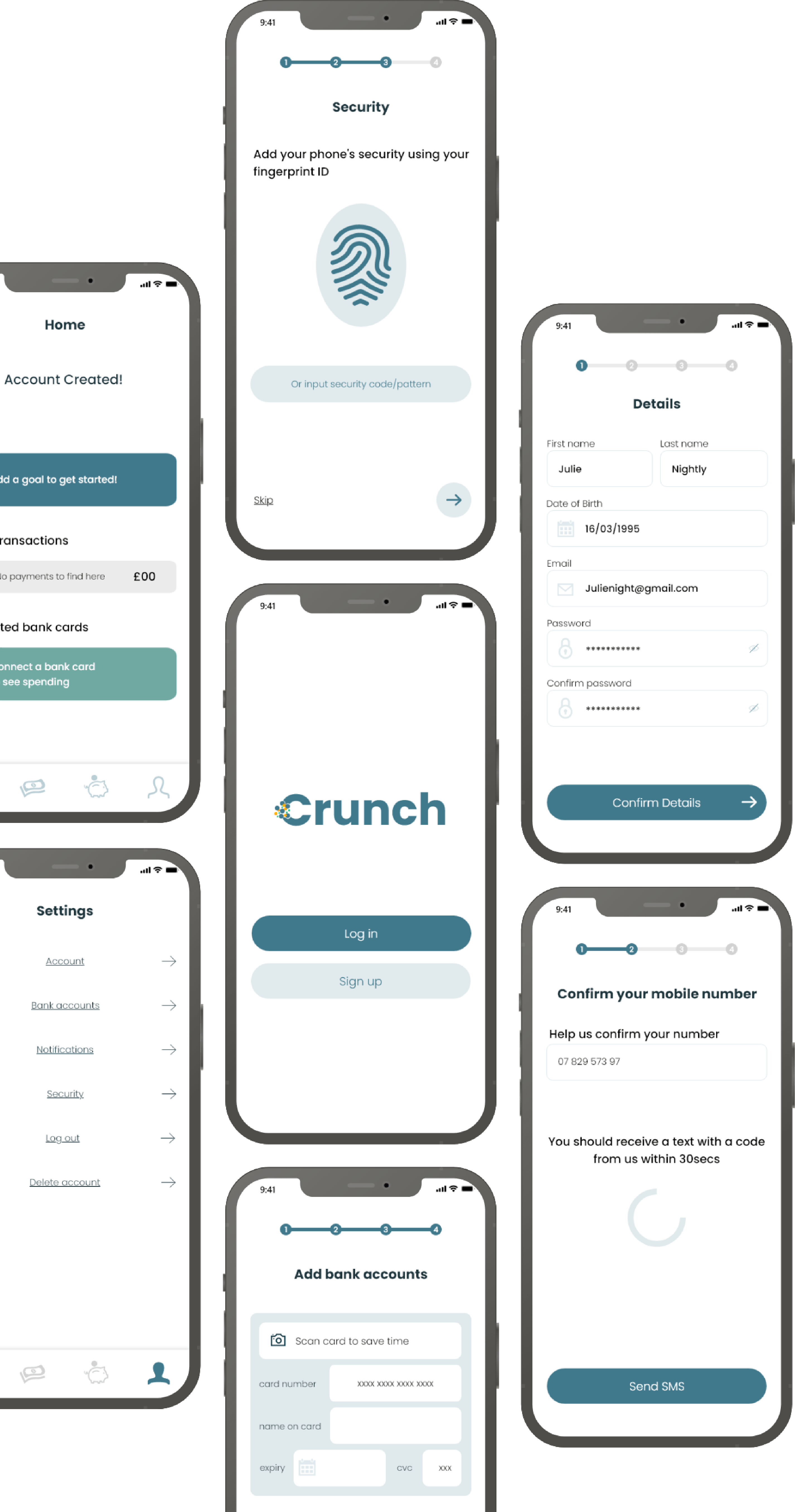
End Result
To conclude this saving app Crunch, I was really happy with the overall look and feel of this functional yet simple app. I feel I achieved this through the mix of modern design pattern I had chosen.
The most useful step during the process was testing on potential users and hearing aches and pains from similar saving apps. With more allocated time for this app I would involve more user testing steps to further strengthen the function.
The main message I learned from this app was to keep as close to the main function I am trying to communicate with users. And to input the process of less is more.
